Words and styling: Sandra Lane/ANM InsideOut www.gulfnews.com
For many people, being handed keys to their apartment in one of the world’s most spectacular and celebrated buildings would mark the end of the process of acquiring a stunning new home. But for Antoine Massad it was just the beginning; it would be another whole year before he would actually move in. First, he wanted to make some changes.

So clear was Antoine’s vision for his Burj Khalifa apartment and so specific was his taste that he designed it all himself, rather than handing it over to an interiors expert. He placed the project management in the capable hands of his executive assistant.
The year it took to complete the home was not due to the demands of Antoine’s busy professional life – he is an international financier with interests in many countries – but due to the extent of the transformation he was seeking. Nothing less than stripping the newly completed space back to its concrete core would do.
The structural demands of building the world’s tallest tower were so extreme that the internal spaces of the apartments in the Burj Khalifa are not especially large (by Dubai standards, at least) nor are they particularly easy to work with due to their atypical shapes. But the way in which Antoine has handled these challenges has emphasised his home’s greatest asset: the light.
Sunshine floods into the south-west-facing space and as it shifts throughout the day, the mood changes too. As the sun sets, from this vantage point it looks as though a spectacular ball of fire is dropping into the sea. As night falls, the view changes completely.
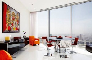
Living 90 storeys above the ground could be overwhelming but Antoine’s choice of materials, colours and furniture performs a conjurer’s trick; it stops the eye from always looking out at the amazing view and pulls your attention back inside.
The key to the apartment’s style was the choice of white for the walls, ceilings and floors that provides a canvas for the furnishings’ dramatic hues, in addition to Antoine’s superb collection of bold paintings by Lebanese artist Silwan Ibrahim.
By introducing wood – of a very different colour and quality from the original finish – and cladding one of the living room walls in a light grey-toned, acid-finished travertine marble, Antoine achieved the perfect balance between cool minimalism and warmth. This combination of materials and finishes offers a hint of the 1950s modernism of Palm Springs, where the best residential architects blended natural materials with plain, painted surfaces.
The front hallway features a floating panel; its long, straight grain looks like the subtle strokes of a paintbrush, its back-lighting with invisible LEDs is a subtle blue tone. The use of timber in the entrance hall has an important function; it creates a cocooning ‘core’ that counterbalances all of the light and defines the break between open-plan living spaces and the private area of the apartment where three bedrooms open off a deliberately unadorned white hallway.
The bedrooms, each with different colour accents set against a white backdrop, are all simple and clean. The beds and other furniture are low to maximise the connection between indoor space and the outside view. All three of the en-suite bathrooms are beautiful; each has custom-built cabinets and a hand basin with a distinctive style.
The walk-in showers are lined with gorgeous materials: the shower in the master bathroom has a silver-leafed glass mosaic in different textures, while in the other two bathrooms the mosaic looks like a tapestry of polished glass pebbles – one in pale aquatic tones reminiscent of mother-of-pearl, the other in opaline colours. More info and photos


