By Paul Goldberger www.newyorker.com
Erecting the tallest building in the world is a pursuit both pointless and exhilarating. Someone will always build a bigger one, but that doesn’t diminish the intense allure of height, which can make a building famous whether or not there is anything else to recommend it. Frank Lloyd Wright, who never much liked cities, understood this perfectly when, in 1956, he unveiled a fantasy known as the Mile High Illinois, a five-hundred-and-twenty-eight-story tower that he proposed for downtown Chicago, overlooking Lake Michigan. An elegant spire, pencil-thin, it was a cavalier dismissal of the gaggle of boxy office buildings that were turning most of America’s urban centers into a blur.

Although it was unbuildable, it grabbed more headlines than any real building could have, and it gave the illusion that Wright was in command of a type of building that he had always disdained.
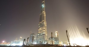
The Burj Khalifa, in Dubai—the new holder of the title of World’s Tallest Building—is no less extravagant a media gesture. Unlike Wright’s design, to which it bears a startling resemblance, this building is very real—all one hundred and sixty stories (or two thousand seven hundred and seventeen feet) of it. For decades, skyscrapers have been topping each other in only small increments: Kuala Lumpur’s Petronas Towers (one thousand four hundred and eighty-two feet) are thirty-two feet taller than Chicago’s Sears Tower (or Willis Tower, as it is now called); the Shanghai World Financial Center is about a hundred and thirty feet taller than the Petronas Towers; Taipei 101, in Taiwan, is fifty feet taller than the Shanghai tower; and so on. But the Burj Khalifa represents a quantum leap over these midgets. Even if you put the Chrysler Building on top of the Empire State Building, that still wouldn’t equal its height.
As with most super-tall buildings, function is hardly the point of the Burj Khalifa. Certainly, it’s not as if there weren’t enough land to build on in Dubai, or any need for more office or residential space, after a decade-long construction spree that makes the excesses of Florida look almost prudent. Dubai doesn’t have as much oil as some other emirates, and saw a way to make itself rich by turning an expanse of sand beside the Arabian Gulf into an all-in-one business center, resort, and haven for flight capital. When the tower was first planned, by Emaar Properties, a real-estate entity partly owned by the government, it was called Burj Dubai, which means Dubai Tower—just in case anyone might have missed the fact that the world’s most high-flying, come-from-nowhere city was also home to the world’s tallest building.
But, while the building was going up, growth in Dubai ground to a halt, leaving much of the new real estate unoccupied and unsold. This past November, Dubai ran out of money, was unable to make payments on sixty billion dollars’ worth of debt, and had to be rescued by a ten-billion-dollar bailout from Abu Dhabi, the conservative, oil-rich emirate next door. At the building’s opening, Dubai announced that the skyscraper would bear the name of Abu Dhabi’s ruler, Sheikh Khalifa bin Zayed al-Nahyan. It’s as if Goldman Sachs were to rename its new headquarters the Warren Buffett Tower.
Dubai is unlike any other city, but imagine a cross between Hong Kong and Las Vegas that tries to operate as if it were Switzerland, and you begin to get the idea. There are more glitzy glass towers than you can count, many of them put up not so much to house people or businesses as to give to rich Indians, Russians, Iranians, and Southeast Asians a place to park some cash away from nosy local governments. Given the general level of tackiness on display—not to mention the often appalling living conditions of Dubai’s armies of migrant construction workers—the Burj Khalifa should be an easy building to loathe, and the embarrassing way that its completion coincided with the near-meltdown of Dubai’s economy makes it easy to mock as a symbol of hubris.
And yet the Burj Khalifa turns out to be far more sophisticated, even subtle, than one might expect. The tower is a shimmering silver needle, its delicacy as startling as its height. You would think that anything this huge would dominate the sky, but the Burj Khalifa punctuates it instead.
The tower was designed by the architect Adrian Smith and the engineer William Baker, both of Skidmore, Owings & Merrill. (Smith left the firm during construction, and Baker and his colleagues George Efstathiou and Eric Tomich saw the project through to completion.) Skidmore has built plenty of iconic skyscrapers before. A generation ago, its architect-engineer team Bruce Graham and Fazlur Khan revolutionized skyscraper design with the “bundled tube” structure of the Sears Tower.
The Burj doesn’t use bundled tubes, though to look at it from the outside you might think it did. From a distance it looks like a cluster of variously sized metal rods, the tallest at the center. The building has a Y-shaped floor plan, with three lobes buttressing a hexagonal central core, which houses the elevators. The structure provides a lot of exterior walls with windows overlooking the Gulf and the desert. The first twenty or so floors are fairly bulky, giving the building a wide stance on the ground, but as it rises there is a spiralling sequence of setbacks. By the time you get about a third of the way to the top, the tower has gracefully metamorphosed into a slender building, and it keeps on narrowing until only a central section remains.
One advantage of this configuration is that, because the building’s shape varies at each level, wind cannot create an organized vortex around it, and stress on the structure is thereby reduced. The setbacks, the Skidmore team likes to say, “confuse the wind.” But the design has an aesthetic virtue, too, giving the Burj Khalifa, for all its twenty-first-century ingenuity, a lyrical profile that calls to mind the skyscrapers of eighty or ninety years ago. The defining towers of the New York sky line, at least before the Second World War, were skinny compared with today’s skyscrapers, and their vertical lines gave intense visual pleasure. We’ve sacrificed all that for efficiency: office tenants today want lots of horizontal space, which means huge, open floors and stocky, inelegant towers. The Burj Khalifa has three million square feet of interior space, which sounds like a lot, but in fact it is four hundred thousand square feet less than the Shanghai World Financial Center, which is fifty-nine stories shorter.
Even the MetLife Building, less than a third of the height of the Burj, has 2.4 million square feet. The Burj Khalifa can afford not to care about square footage because, notwithstanding a few small, high-priced office suites on the narrow floors at the top, it isn’t an office building. Most of the building is given over to condominium apartments. (At the bottom, there will be a hotel designed and managed by Giorgio Armani.) The decision to make most of the building residential speaks volumes about the extent to which Dubai’s economy has been based on the sale of condominiums to absentee owners for investment. Whether or not the decision to fill the tower with apartments made economic sense, it was certainly the right thing to do architecturally. The profile of the Burj has a magnetism that is lacking in almost every other super-tall building of our time. Furthermore, the tower doesn’t indulge in the showy engineering tricks that have become so common today; it doesn’t get wider as it rises, or lean to one side, or appear to be made of broken shards. There is something appealing about a building that relies on the most advanced engineering but doesn’t flaunt it.


